
Wall paint is used to achieve appropriate decorative finishes, alter appearance, and renew or improve it. Each of the existing technologies has a specific function and use. In this blog we will talk about the different types of paint that are the most popular. do not miss it! And if you want to expand your knowledge, you can get a master’s degree in master craftsman in decorative drawing in construction.
The color we choose to paint our house is very important. Colors give us sensations and emotions, some sad and some very happy. Therefore it is important to use the color according to the profile we want to give the room and then use the furniture and accessories that go with it.
Types of wall paint
Choosing the right wall paint depends on several factors. For example, it will be necessary to take into account whether it is an external or internal coating, as well as decide what decorative effect you want to use.
Interior wall paint
Interior paints should be less toxic, have less odor and dry faster. It can be classified as:
Latex or plastic paint
This type of paint is most commonly used on interior walls. Well, it is easy to apply, washable, waterproof and quick drying. You can choose between:
- Acrylic: very resistant to mold and sun. Protect and decorate.
- Vinyl: It is mainly used for painting walls, decorations and ceilings. Therefore, its function is more like protection. In addition, it requires only a layer of paint and is easy to apply.
Depending on the ending
Speaking of paint finish, it refers to the final appearance of the paint once it has been applied and dried:
- Matte: The finish is dark and dull. It is suitable for damaged or uneven walls.
- Satin: intermediate point between luster and luster.
- Luster: Highly reflective and washable. It is recommended to apply it to a perfectly smooth and clean wall.
synthetic enamel
It turns out a strong and resistant type of coating. So it works for both interior and exterior walls. It is used on walls and on wooden or metal surfaces, such as the bathroom or kitchen. However, the drying time is 4 to 6 hours or even 24 in the case of the second layer.
Mineral
This paint provides a glossy finish with a very stunning metallic effect. Its main use is for decorative work.
Varnish
The most common base for varnishes is their polyurethane base. They differ depending on the solvent used with water, diluent, turpentine, or oil. They are used to protect materials such as wood or to give them luster and colour.
exterior wall paint
Exterior paints must be more resistant to weather conditions and the passage of time. In addition, this type of coating is not only used as an aesthetic matter but also to prevent damage from moisture in the home, etc. Here are some types:
- Acrylic: Its durability is not high but it is easy to apply.
- Acrylic polysiloxane: very resistant to moisture, rain and sun. It can last up to 15 years.
- Plastic: Provides coverage and adhesion, perfect for avoiding cracks.
- Flexible: It is especially recommended for use on irregular surfaces because its formula allows it to be easily softened and spread.
Color combinations for interiors
Below we show you some examples of these color palettes that can be applied to spaces, so you can get inspired.
Old pink, beige and gray
This soft pastel palette is designed to represent Japanese simplicity and Scandinavian design.
It consists of tones inspired by natural materials, a well-balanced palette of cool and warm tones, very comfortable. She has a great neutral versatility.
- It features calm pastel shades of gray, beige and soft pink.
- A palette reminiscent of vintage motifs but updated in modern beige tones.
- With this type of color, very comfortable and calm spaces are achieved.
Earth, green and coral tones
It is a unique combination of modern design mixed with a boho vibe. The result is a range of colors that harmonize very well. From silky earth tones to soft coral, these colors are a link to the comfort and pleasure found in everyday life.
The tones pair well with vintage-inspired accessories and warm, earthy finishes. It’s a beautiful, warm palette of neutrals and light.
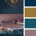
blue and brown
Here, neutral beige tones are skillfully combined with rich blues and mustards, colors that can accompany everyday life and bring balance and naturalness.
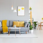
Greens, mustards, and pinks
this palette is perfect for anyone with a passion and energy.
These colors are an invitation to play and have fun. Energetic and smart, this palette has a lot of charm. Cool pure white punctuated by stunning bursts of bright colour. Its mission is to bring humor and warmth, and to help us remember that deep down we are still children who love to play.
Adding pops of color, whether through a sofa, artwork, or accent walls, is the perfect choice for those who love to enjoy décor. It’s about letting go of stress, having fun, laughing and playing again. Tones of fuchsia, aqua and gold add fun and warmth to the setting.
Pastel tones combined with bright fuchsia can be an excellent palette for home decoration.
Yellow, beige, green
This palette is perfect for those looking for an oasis. Inspired by the seasonal cycles of the earth, it features subtly rich colors of sea, sand, forest and sky.
It’s about bringing those organic items home.
A reminder that sometimes true beauty lies in the spaces outside our ceiling and calmness comes from knowing that perfection isn’t the only way to be.
Blue
Azul is small and
also returns the primary colors, red, yellow and Klein blue.
Dark blue
This house shows an intention to remember the colors of the ocean. With this beautiful color, the details of natural wood and mint green are highlighted.
Light Blue Cake
This aged blue Celeste brings a lot of serenity. For this reason, it is ideal for bedrooms or any room in the house where we want to create a peaceful environment.
Blue mixes
When only one color is not enough to give the walls the desired effect, you can use different shades of it. It can be used in different styles, such as painting cornices, moldings and other finishes a different blue from the wall, or panels in another shade of blue to attach to the wall and get a very good decorative trick with it. .
The different shades of blue complement nicely with the wood floors and bronze details.
Verdi
Many shades of green are seen, though the trend is to go from the darker, more saturated shades we’ve seen so much in the last year, toward more natural shades and vitamin shades: shades of sage, celery, and avocado.
Green sage and celery
Bluish Green
This deep green can be used as a decorative accent on an object or on a wall. Let’s look at some examples.
Touches of orange make a great addition to a green saturated space. It is a perfect color combination, beautifully contrasting with gray or beige.
With the wide color palette in existence today, you will always find the one that matches your personality. When colors we like are unusual, it’s best to use them in a room that isn’t exposed to more people than you are, like your bedroom. If the combination is good, you can try it later in the living room or dining room.
Mint green and beige
these two colors combined create a very serene space.
Lime green
this color never goes out of style. You can use it to give your home more power and influence than the neutral colors you already know. Although we know the score is safe with neutrals, sometimes it’s a good idea to switch up.
This photo shows us how strong color on the wall can be the most important decorating tool in the entire room, as furniture, as you can see, is still a great thing, but nevertheless, everything looks better with an intense background.
Blue and green
When combining black and white accessories, green and blue look perfect and harmoniously.
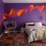
Red and purple
Warm and earthy tones are also in fashion, but they are getting brighter: orange and burgundy red.
Lilac
also violet and lilac.
Light lilac
In addition to being modern, it is very original, it is an intermediate color between lilac and gray. Lilac walls can be combined with mint and peach, which are fashionable shades today. It also combines well with its opposite color, burnt orange. Besides the gray color it looks very elegant, as we can see in the photos below.
The color of the wall can also be supplemented with graphic elements, such as artistic images.
Rosa
‘s many sophisticated shades of pink have taken center stage in previous years. These interior paint colors still apply and we’ll show them below.
Light Pink
This shade of pink is still used.
These colors fill all spaces with light, so they are one of the best options for decorating small homes.
French rose
There is nothing better than a well-lit room, which is why warm colors that add and enhance light are becoming more and more popular. There is a color in particular that catches the eye, French pink, which is a very bright color and is undoubtedly one of the current trends.
Some trends are based on soft pastel colors, and many of them are difficult to describe because they are not specific colors, but a mixture of several colors. Rich in subtones, these pastel shades make our task a lot easier when it comes to décor as they are easy to combine with other colors.
Combined with a deep mint green, it can achieve a retro look, with terracotta tones looking elegant, or with subtle shades of white achieving a super feminine look.
Salmon, orange and peach
orange undertones have a gift that emits a lot of energy and warmth.
Cream
Yellow Pale yellow, in cream tones, is beautiful when combined with pastel tones, and has great power to light up a room.
Sunny Yellow and Mustard
Pure yellow chairs can be a bit risky, but here they look great, paired with green.
Gray Raw
The best way to modernize a traditional home is to use gray.
Whites
Of all the tools available when decorating a home, wall paints are the ones that never fail. Eternal white is a safe investment.
Conclusion
Painting the walls is one of the most important tasks of decorating our home. Once painted, the room can completely change, to look like a new and spacious room or just the opposite, small and dark. We just have to learn how to choose colors for paint, following the advice of professionals. We will take into account that soft and bright colors expand the room, while dark colors reduce it. By following these rules and taking into account fashionable colors as a reference, you will definitely find the perfect shades.