
When we seek to combine colors, we want to create contrast but at the same time, harmony. In the case of our homes, it can sometimes be boring to find the perfect wall color that complements perfectly with all our furniture. By choosing the colors of our walls correctly, the furniture will appear more than usual and will give our home the look that we most desire.
In this article, we will teach you how to combine walls with your furniture in order to achieve the atmosphere you want: elegant, modern, romantic or even spacious. It’s all about knowing how to combine cool, neutral and warm colors with light, dark or white polished furniture.
light furniture:
For furniture in light colors, pastel colors will be perfect. For example: if we have light wooden furniture, then combining it with the pastel pink walls will achieve the effect of a harmonious and calm space. Other pastel colors that you can use for these occasions are: purple, green, light blue and yellow. The key to combining furniture with light tones is “old” or “dirty” colors, you can use whatever color you like as long as it is in light tones.
white furniture:
White furniture is one of our favorite things when decorating a home, when combined in the right way it can give a very classic and sophisticated touch to our home. Imagine room walls in terra red color and white furniture, in this way we will create a warm and welcoming space without neglecting elegance and modernity. Remember that in this case your allies will be in warm colors such as: yellow, orange and reddish.
dark furniture:
For furniture of a dark color, whether it is wood or another material, we will use cold colors for the walls. If our furniture is dark, then we will need a background of light walls so that it stands out, for example: white, light blue, light green, purple.
Now you know the perfect combinations of your furniture according to its tones. Remember that colors have no rules and all tastes are different, the important thing is that you and your family feel comfortable in your home. We hope this article helps you with your next redesign.
Do you know how to combine colors well?
A good combination of furniture colors and wall colors is also an art and essential if you want to have a house 10 in terms of decoration. Let’s see what the secret is.
When it comes to combining colors, one of the best ideas is to create contrast: this way, both the furniture and the colors on the wall will look much better. In this article, we show you different ways to achieve a stylish and modern space based on choosing the colors of the furniture well and knowing which room colors should prevail (or not). How do I do it? In short: perfectly combine neutral, warm and cool colors with light, white or dark furniture.
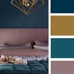
Light woods, grey, pink: a chic oriental style
In this living room, we combined four pastel shades : dusty pink and blush white on the walls, and sand, gray and pink on the furniture. As you know, there are different colors of wood and in this case, the color that combines the most is the tone of the light wood.
This combination is perfect if you are looking for a fun and quiet space , with a very elegant touch that evokes Scandinavian style at its most beautiful version. To achieve this, these are the keys :
Soft colours. With its aging and somewhat “dirty” pastel, it is characteristic of Scandinavian-style interiors, a great ally for gaining light and warmth in the house .
Furniture. Made of light wood and straight lines , the pieces are usually discreet and functional. Oiled or untreated finishes to enhance the natural feel of the wood.
If the colors of your furniture tend to be light or light-colored, paint one wall in shades of pink and the other in bright white.
Publications. Bet on plain furnishings and curtains and offer some discreet prints on a pillow or plaid. Geometric shapes are typical of a Nordic look.
the elect. The painting on the walls is by Jotun. Couch and rug, by Westwing. The coffee table is by Nordicthink and the cabinet is by Velavusta.
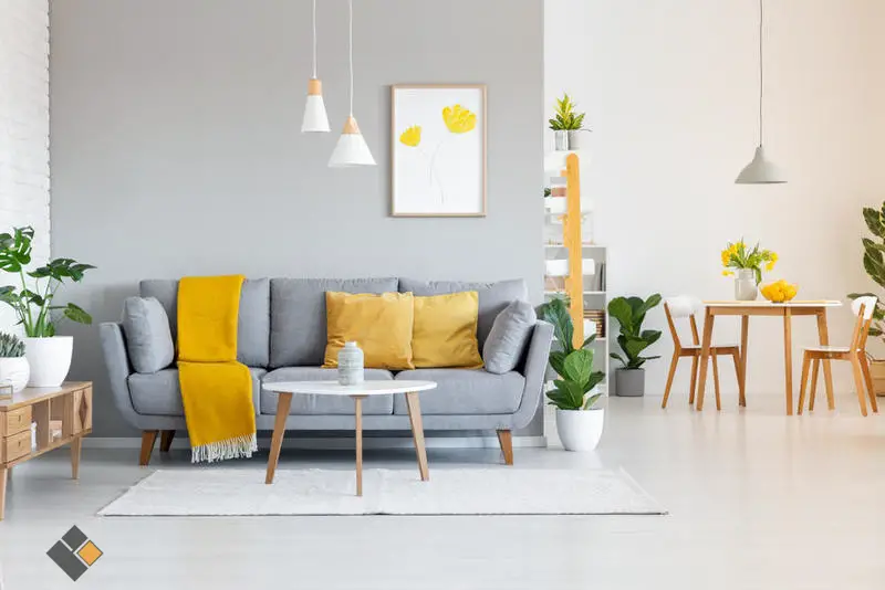
- White, grey, cream, tan, sand and dusty colors are ideal colors to use as background, as they have a high percentage of white and give color without being too prominent in the decoration.
- If it is clear it expands the space. And it is very versatile: with it you can create spaces of all styles, from classic to sophisticated.
White and red furniture: a British touch
Although creating a striking contrast, this color scheme maintains its elegance thanks to the fact that the furniture and accessories have a harmonious tone.
In this dining room, we painted the walls in two completely dark colors, tile and brown, so the silhouette of the white furniture would stand out. A Quick-Step wood floor and light-colored rug add light to the dining room. Here are the keys to this English-themed dining room:
Intense colours , such as reddish and green , are used in British interiors to gain decorative strength and add warmth, compensating for the lack of sunlight.
Furniture. In contrast to the tones of the walls, the furniture is usually light in color and inspired by the classic style. Many have been painted white or cream to make them stand out.
Tile and mink create a very cozy atmosphere. To compensate for the “darkness”, choose white furniture
Publications. Flowers, stripes, checks… If you want to recreate a British atmosphere in your home, include some of these motifs on drapery or in a large palette , as is the case here.
the elect. The sideboard and lamp are by Cottage Little House. Linen tablecloth and rug, by Filocolore. The chairs are from IKEA.
- If you need to get warm, feel free! Warm color palette – yellow, orange, reddish … – will raise the temperature of your home.
- The yellow color range is closest to the color of sunlight and creates bright environments.
- The red color reminds us of a sunset and the walls create a warm and collected atmosphere.
Dark and blue wood: comfortable and urban
In this bedroom we painted a blue wall to match the stone-colored bedding and headboard. So the dark wood headboard and nightstand are the most main characters. These are the keys:
Colors. In a room with a lot of natural light or where you want to create a “hugging” environment, paint the furniture in intense colors. If you combine it with a neutral one, it will make it shine (even) more.
Furniture. If it’s dark, they need a light background to show off and not to darken the environment. Apply the intense color to the wall you’re backing a few pieces.
With dark furniture, the tone of the stone is ideal as a background. For contrast, paint another wall a darker blue
Publications. The “friends” of urban style are simple and pseudo-people who do not burden the decoration. As well as the same-colored fabrics, but with a fabric such as tricot or tricot.
the elect. Jotun painting and headboard are from Cottage Little House. Zara Home chair and blanket. Filocolore blue duvet cover and Indo Pacific bedside table.
- Blue, green, purple … If you combine them with contrasting colors, they will lose the aura of “sadness” that can surround them.
- Use it if you want to freshen up and expand the room because cool tones go out of sight, unlike warm ones.
- If you add white, it will give them more gloss, and if you combine soft cold colors with other more intense colors, you will get a discreet and elegant space.